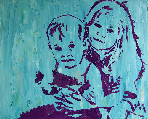
It's probably hard to tell from this image, but the aspect ratio of this painting is just a bit different - 8x10 instead of 9x12. It's every so slightly more square and it was interesting to me to see how this seemingly inconsequential change makes a noticeable difference in the way the image is framed by the background, and how the stencil placement needs to be adjusted to accommodate the new proportions.
It really makes you think about painterly decisions about canvas size, which were obviously made before the artwork existed. Although, it's true, of course, that many old masters (whether painting frescoes or oils) were commissioned to do pieces of a specific size to fit preexisting wall spaces, so their process had more to do with envisioning the best composition within the assigned size. But what about all those mid-size still lifes and landscapes? When next I find myself in the museum (and when, oh beloved but extremely loud Jakey, will that be?), I will try to think about this more.
In any case, I am rather grateful that I can do my previewing layout mock up lickety-split in PhotoShop, rather than having to graph out a cartoon like in the days of yore.

No comments:
Post a Comment