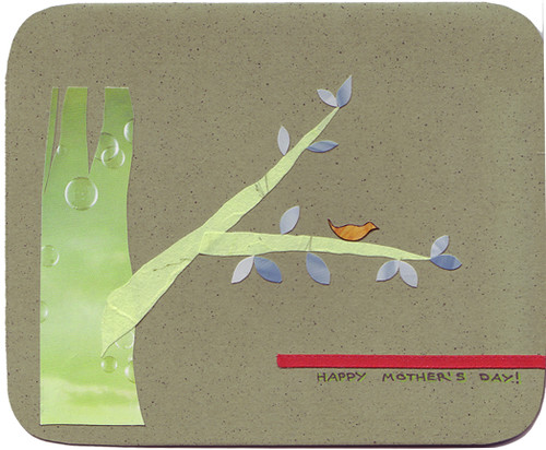
I'm also trying to get away from literalism in my collages. I have trouble realizing that if you are trying to cut out a tree then you don't actually have to find something that looks like bark and something that looks like branches. It's enough for the shapes to denote the objects.

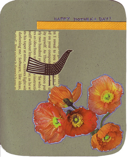
Then again, flowers are pretty. Also, it's fun to keep some newsprint around for a while as it yellows quickly and quite nicely. I should get some foreign-language newspapers for this - it would even better if the text were not immediately obvious.

I can't believe I didn't realize until I actually composed this post that common image in these cards is birds. I guess I like not just square houses but birds also... Duly noted in the post title.

No comments:
Post a Comment